The challenge of the Branding project for Campana, by Grupo Fleury, was to reposition the brand in the access segment, which is a well-known name in the region where it was implemented, as a traditional laboratory. The project included the development of a new visual identity, which would communicate with the access public and generate a connection with them, perpetuating the brand in the customers’ memory.
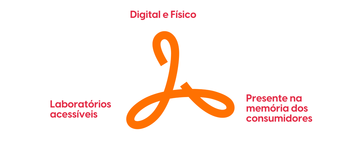
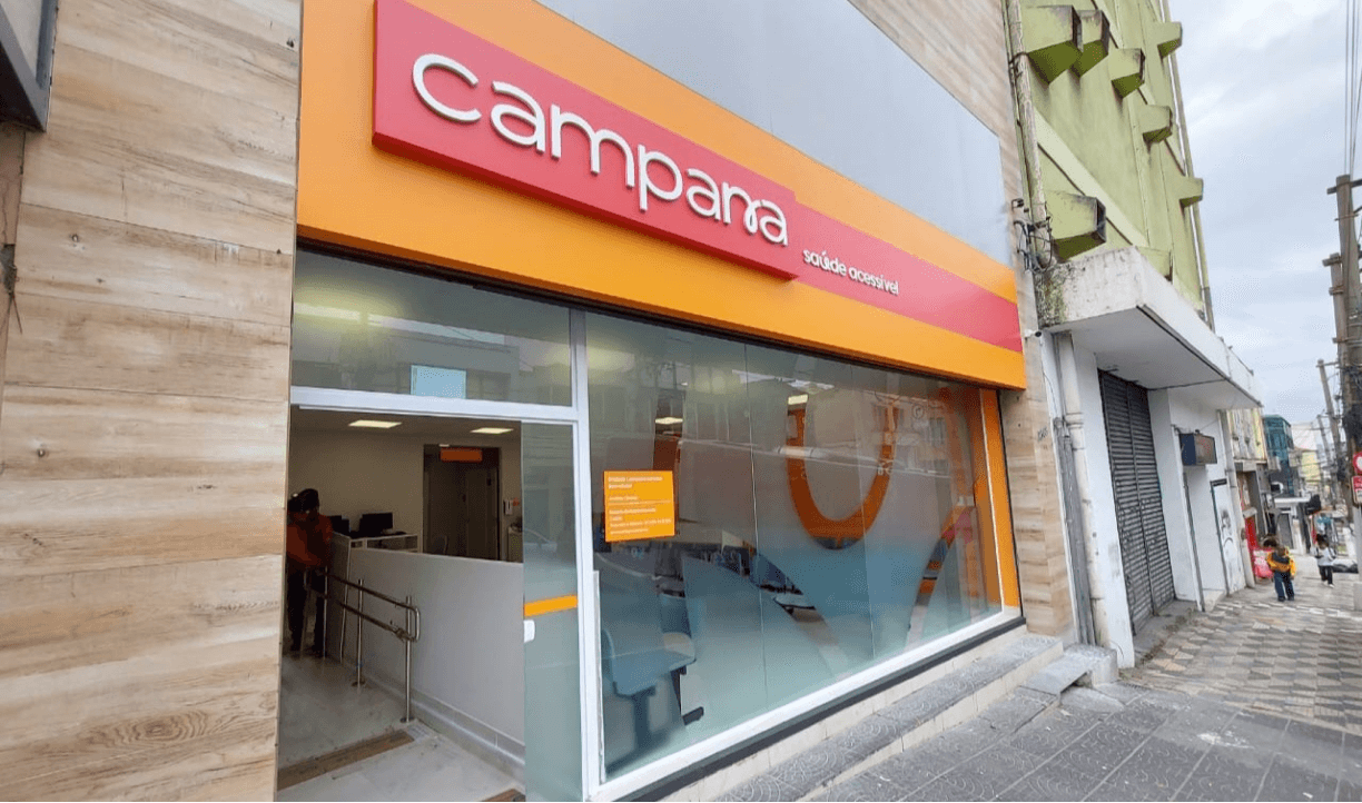
The objectives of this project were to reposition the brand to promote access to quality health services, communicate that the laboratory that previously handled only digital calls, now performs its services in a physical and face-to-face location, and make Campana memorable for its audience.
Strategy.
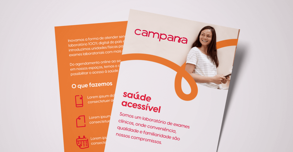
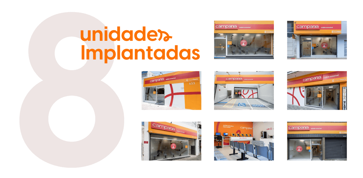
Campana is a clinical exam laboratory, where convenience, quality and familiarity are its main commitments. The Strategy was created keeping in mind Campana’s innovation in its form of service, being the first 100% digital laboratory in the country, seeking to expand its services by introducing physical units, to collect laboratory tests more quickly. From online scheduling to facilitated service, its commitment is to provide access to health for everyone.
Campana’s repositioning was essential for its proximity to the public, operating in an easy and economical way in an access segment, maintaining its already recognized quality of results.
Brand.
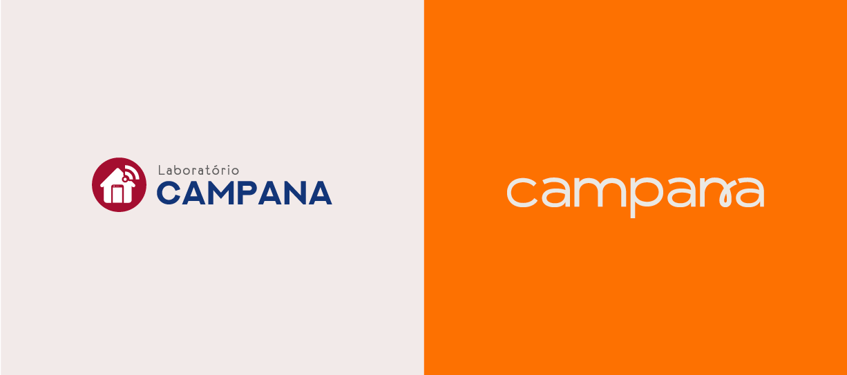
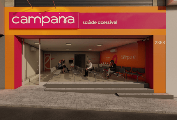
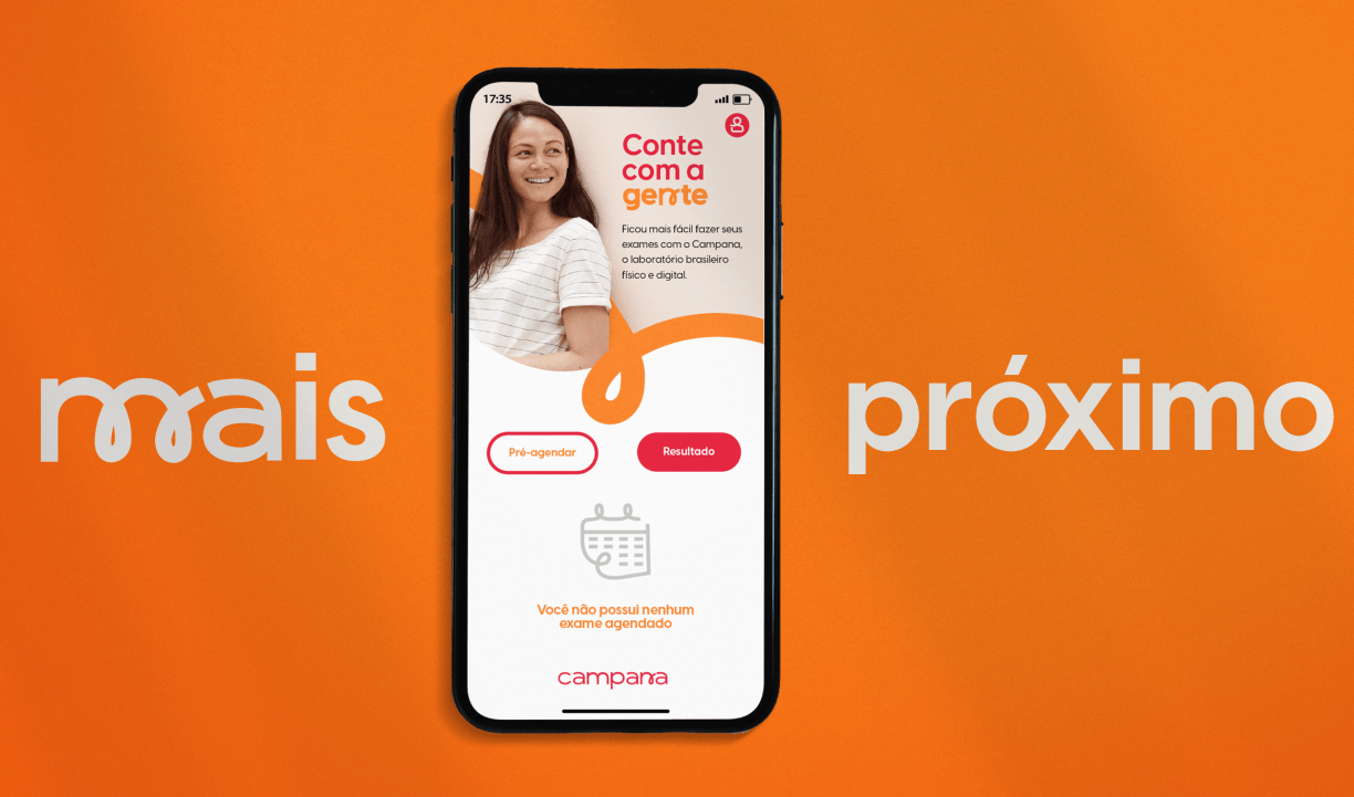
Campana’s repositioning also included the development of a new visual identity, helping to strengthen the brand in a new environment, the physical one. Today Campana is in operation with the new identity, applied on its website, instagram and in all the physical environment, transmitting all its concern and care with the access segment. The Branding of the brand, together with its quality services, generated a high value perceived by its public.
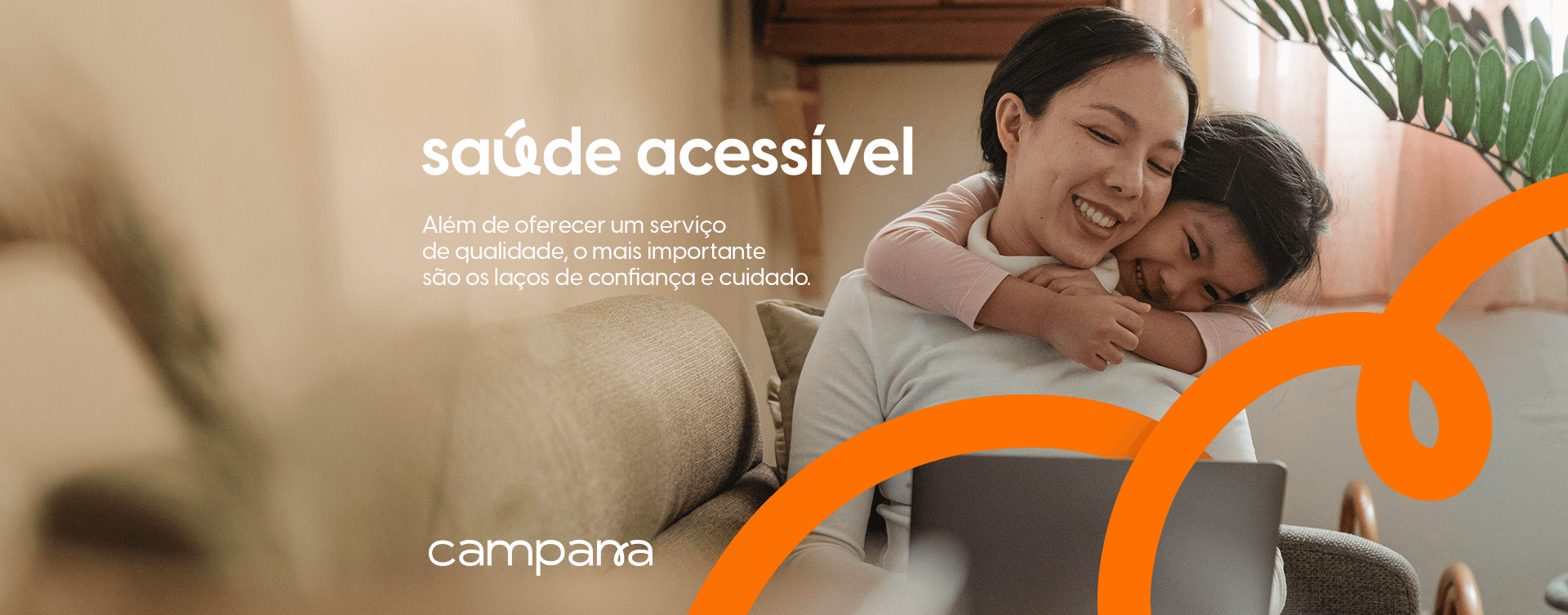
The tagline of the brand, “accessible health”, expresses Campana’s great purpose, which is to provide quality services through agility, ease and economic viability.
Colors.
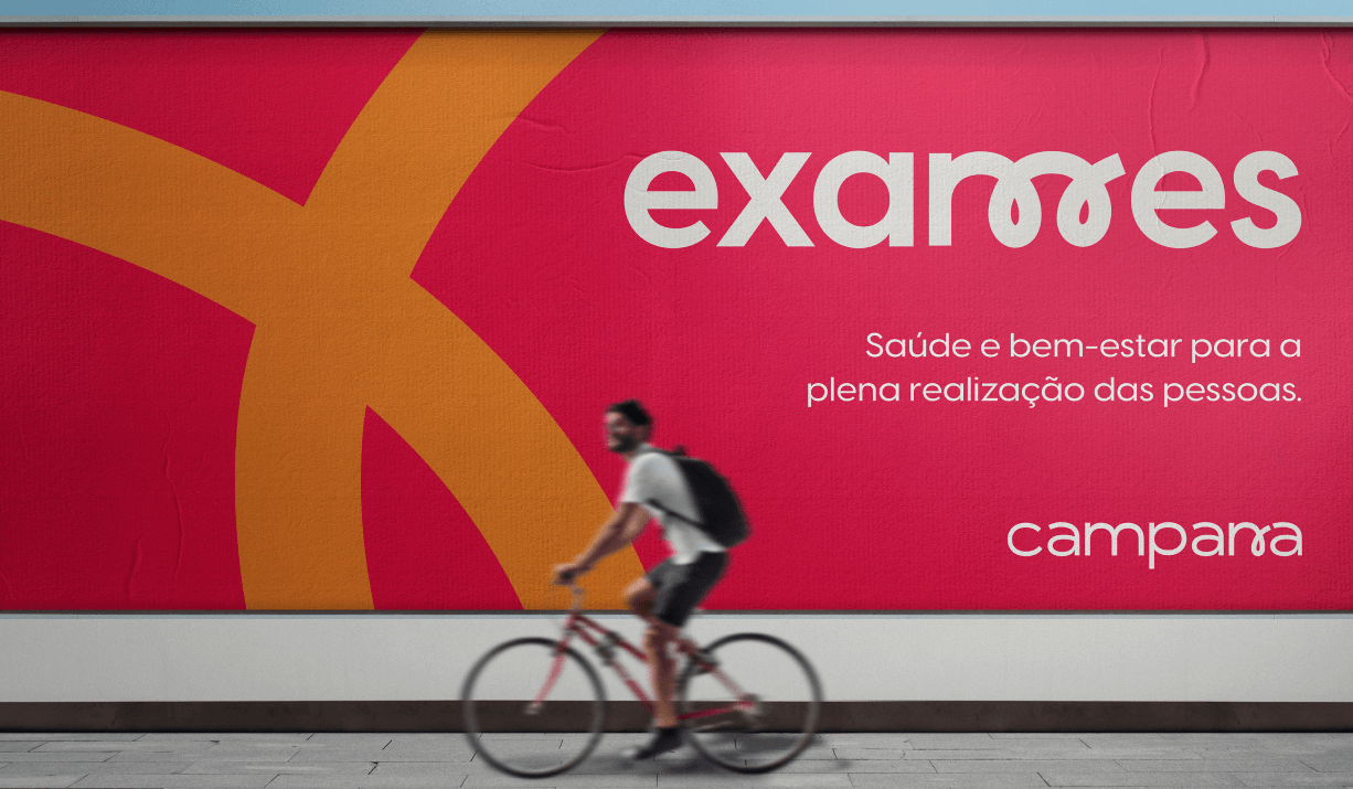
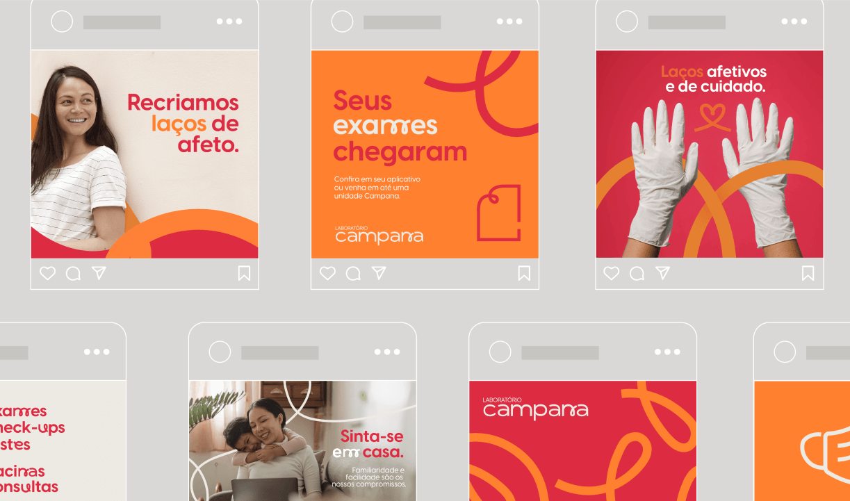
The brand’s renewal also included new colors, in order to move away from the test laboratory market, where blue and its variants are predominant colors, with coral as the main color and orange building the chromatic universe.
Lettering.
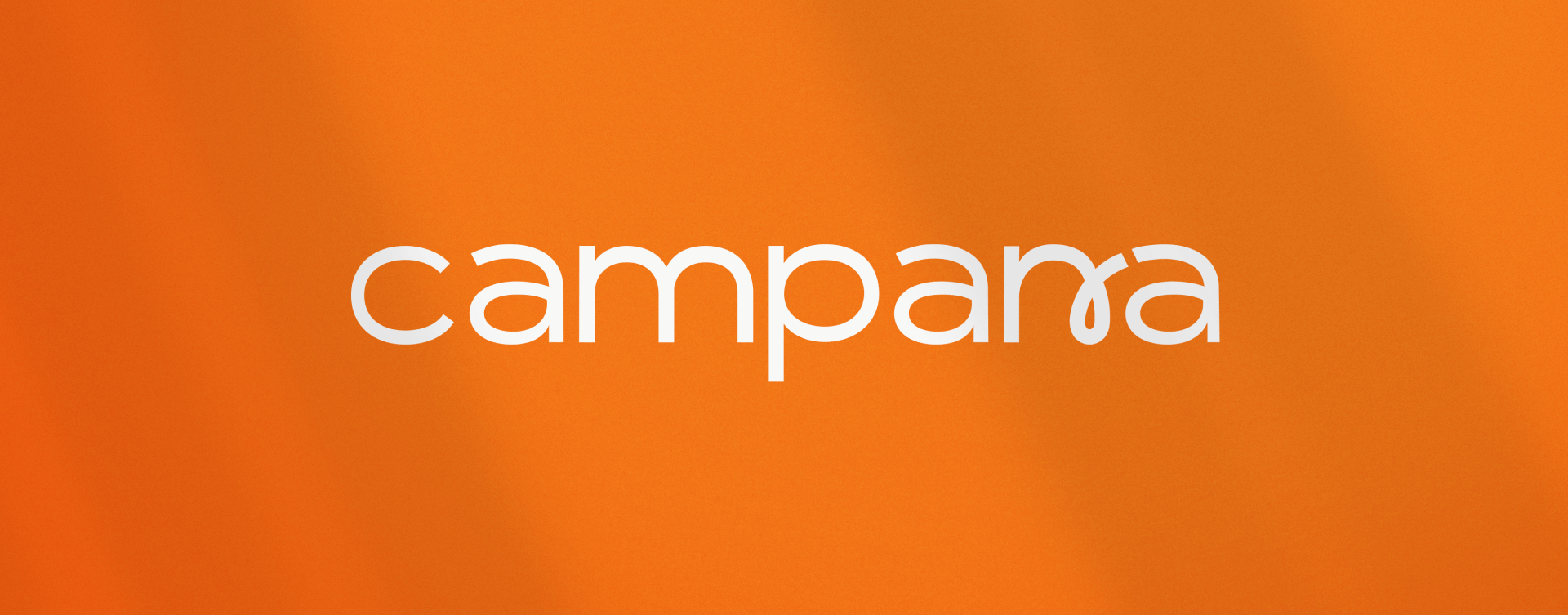
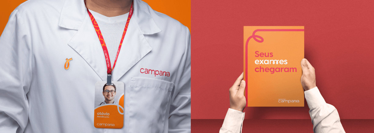
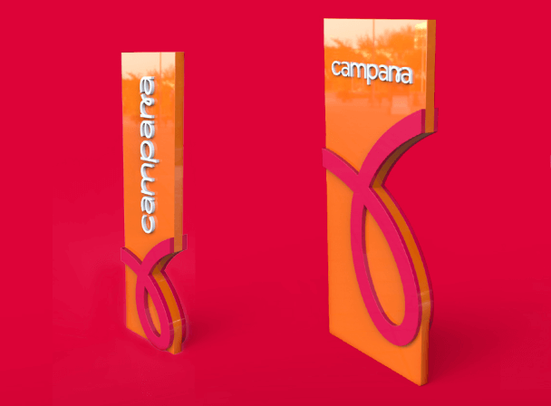
Campana’s main brand is composed of the lettering of the name, and the conscience loop as a primordial visual element of its identity, inserted in a subtle way. From this, the letter N of Campana was designed in cursive form and organic movements, reinforcing the message of care and familiarity.
As an extension of the brand, Campana’s identity also featured a set of letters designed for different words, which refer to the movement of the bow. Increasing the visual appeal.
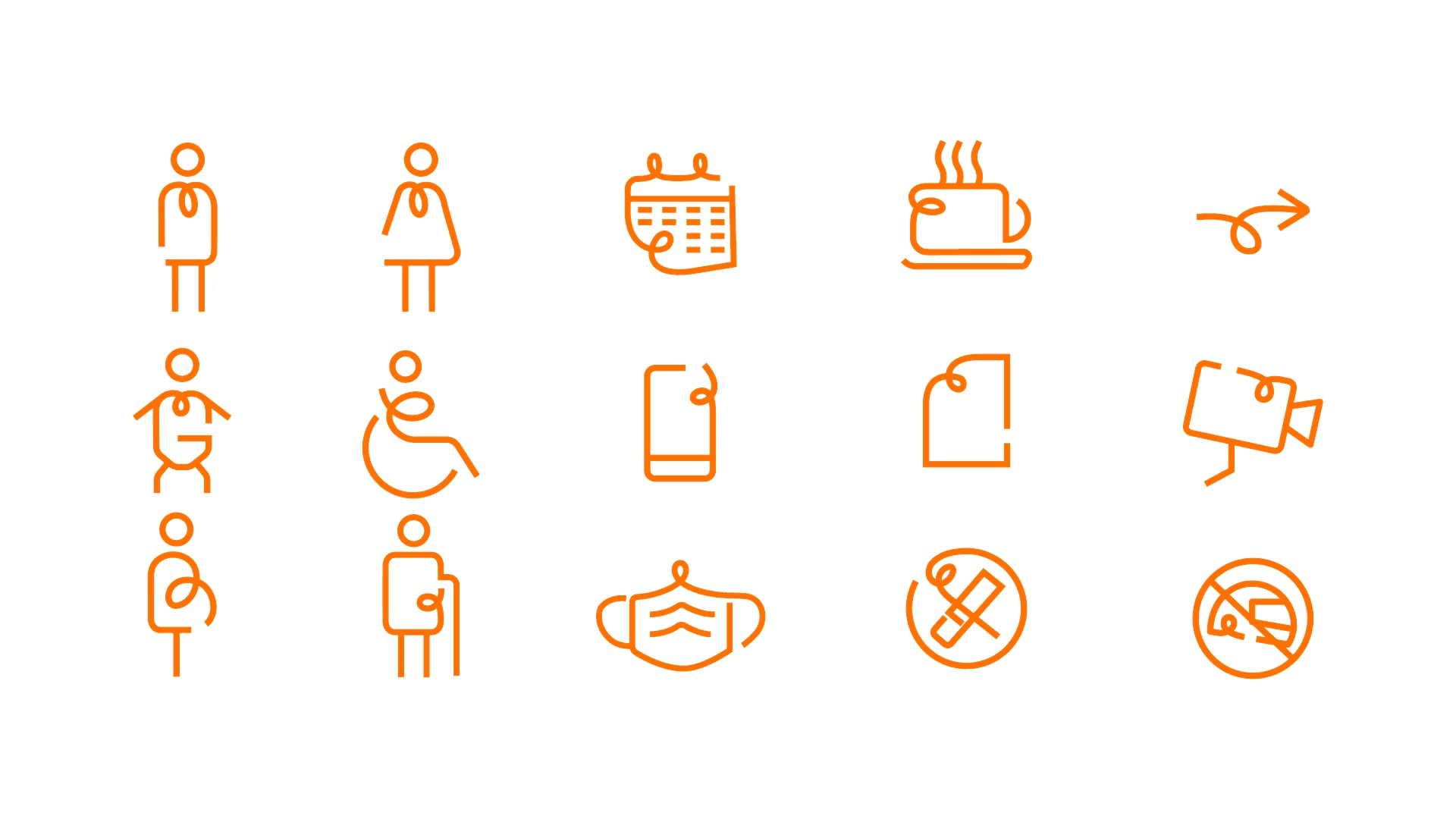
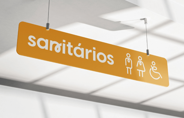
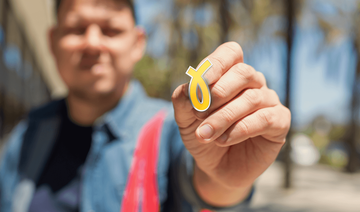
Pictograms.
The bow was also explored for the creation of icons and pictoramas that were the face of Campana. Taking the brand presence into subtle details also in the signage
Communication.
Relaxed communication was all Campana needed to stand out in a serious environment such as laboratories. Always keeping close to your audience and communicating in a simple and clear way.
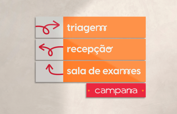
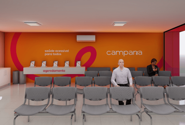
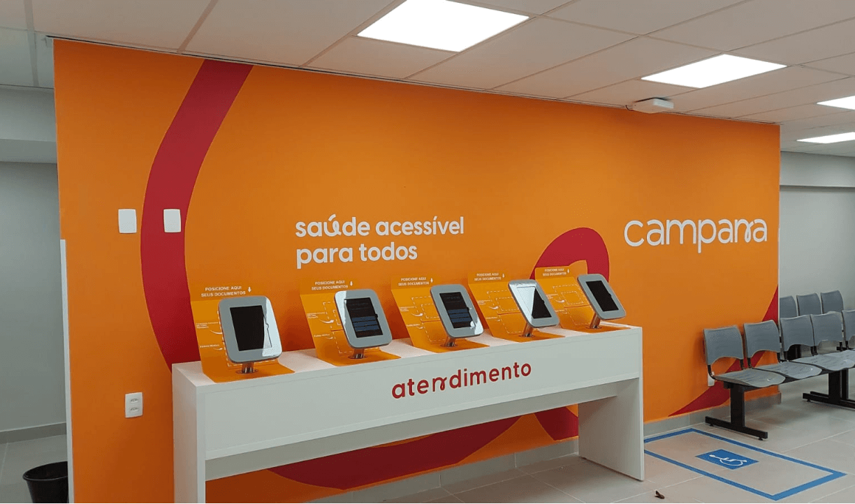
Signaling and Habitat.
The project brings a bit of relaxation to the access segment for an environment as serious as the health and exam laboratories that Campana is inserted in. All its applications were made with the public in mind and so that the identity could convey the brand’s positioning, without losing its clarity and legibility through the signs.
Results.
Campana’s repositioning, along with the development of a new visual identity, helped with brand recognition. Today Campana is in operation with the new identity applied in all physical and digital environments, transmitting care with the access segment. The brand’s branding together with its quality services generated a high perceived value by its public in the state of São Paulo.