Branding, product design, trade design and strategy.
About the project.
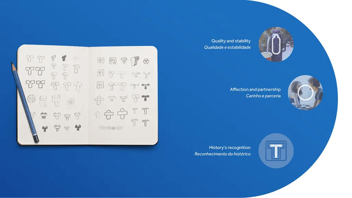
With 58 years of history, Termolar is one of the biggest brands of thermos bottles in the country. Its pillars are the union of tradition with technology, and the constant improvement of its products. To assist in the strategy of this new stage of modernization of its communication, Termolar counted on the Creative Group.
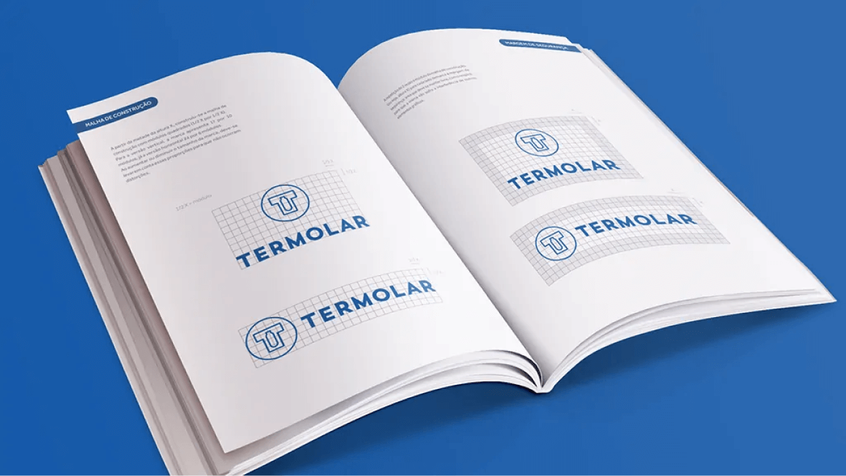
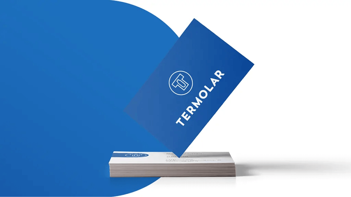
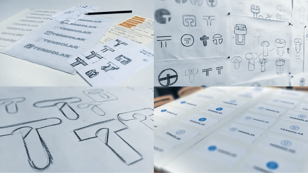
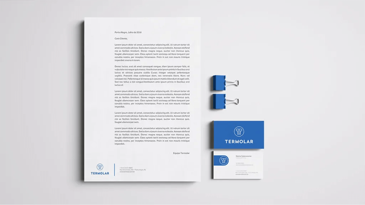
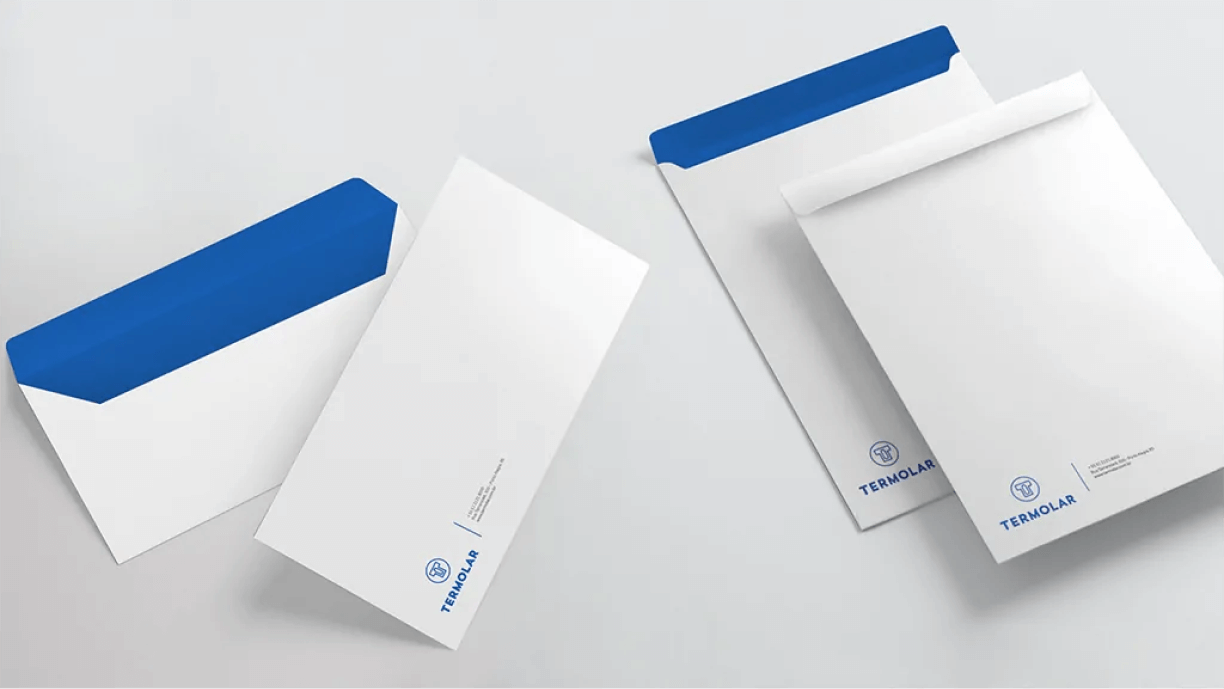
Through consumer and market research and diagnostics, Grupo Criativo detected the need for a renewal in the company’s language and positioning. To achieve this goal, the result was an incremental redesign: the brand was renewed and evolved without losing its essence and respecting its history. In addition to the redesign, the product lines were reorganized according to the segment of use and public and graphic materials were developed, such as stationery, point of sale materials, catalogs, new prints, online presence, among others.
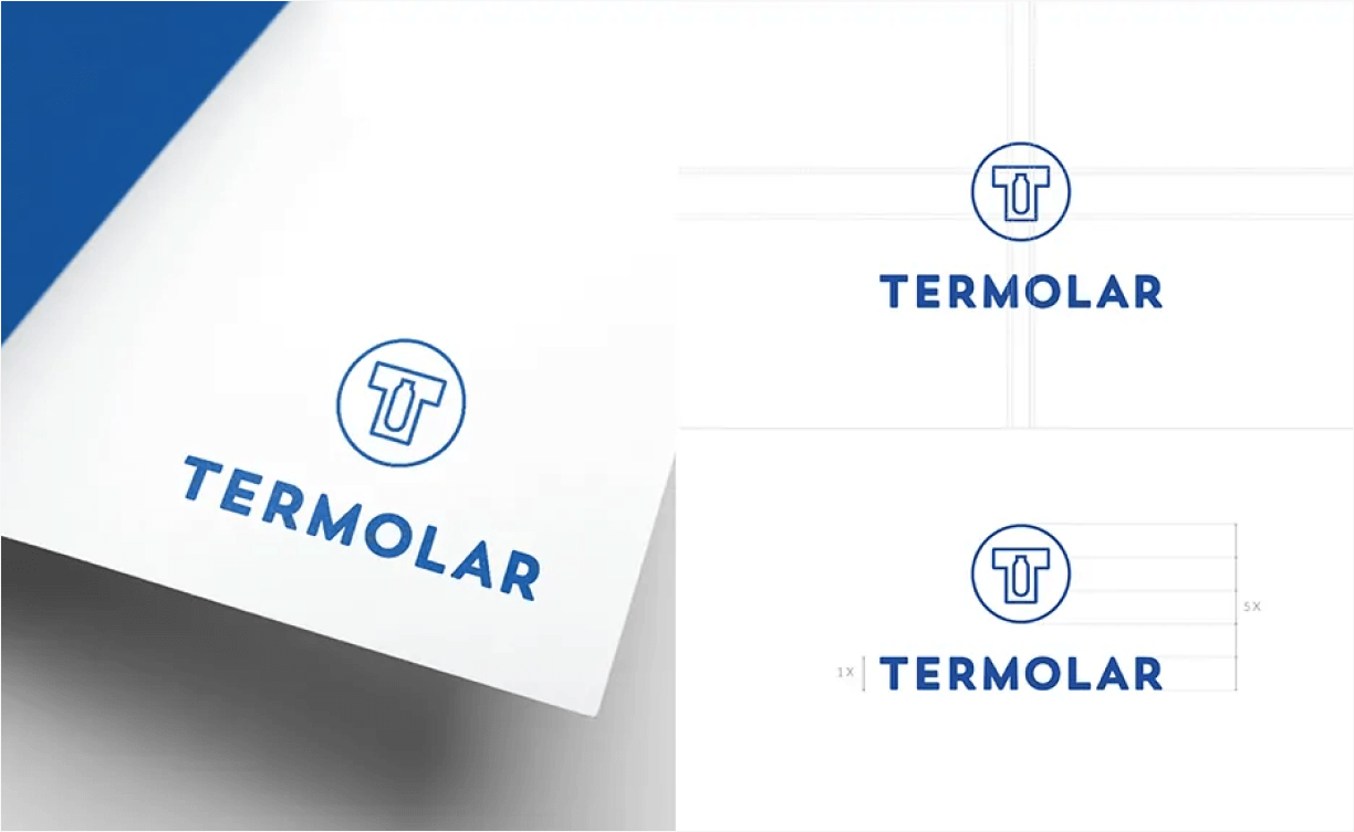
Visual identity.
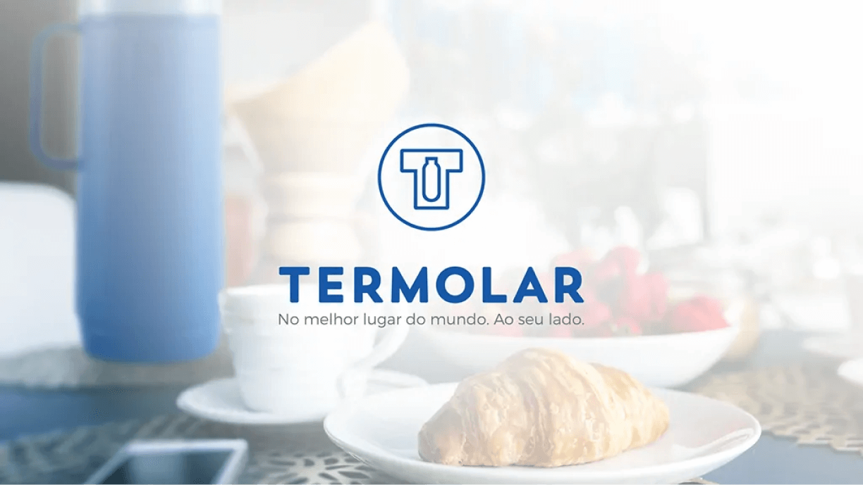
The new visual identity strengthened the company’s alignment with a new positioning and new lines. The slogan “In the best place in the world. By your side.” it portrays a new moment for the brand that today delivers more than thermal products to its public, but rather solutions for its world. The quality that the consumer already knows, adapted to his life. In addition to reinforcing its innovative position and its evolution to the market and diversifying communication, the new Termolar moment makes the company open to new markets and new audiences.
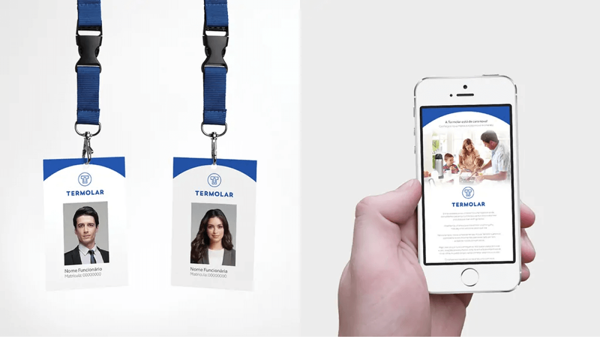
The new identity was transformed into POS materials such as rulers, stoppers, displays and stickers for the products. The materials present the new positioning, reinforce the colors of the lines and strengthen the brand’s presence at Points of Sale.
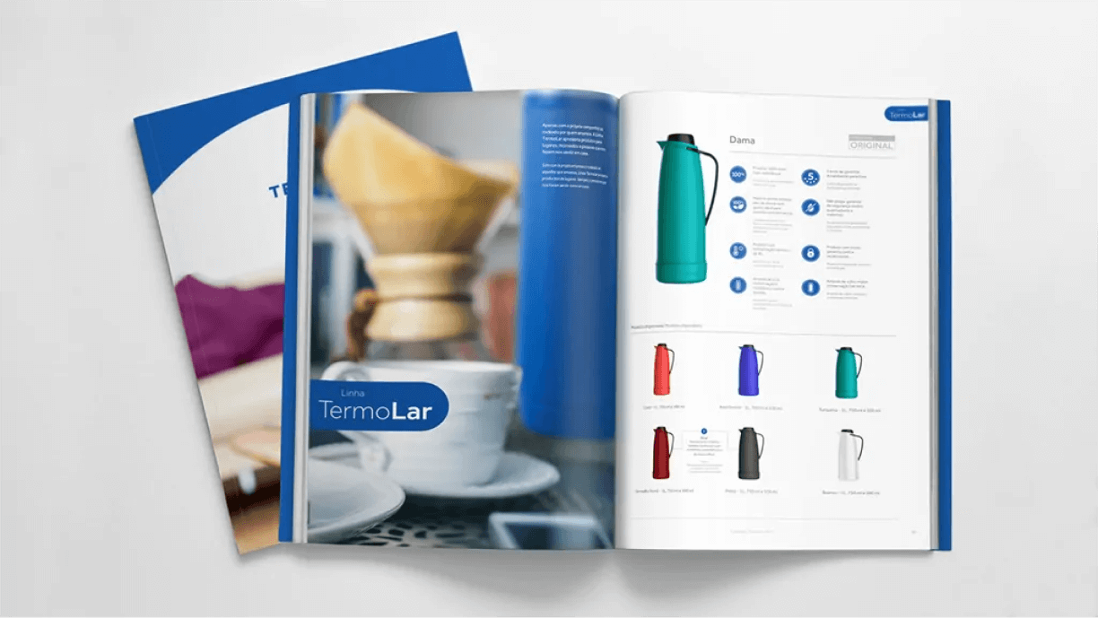
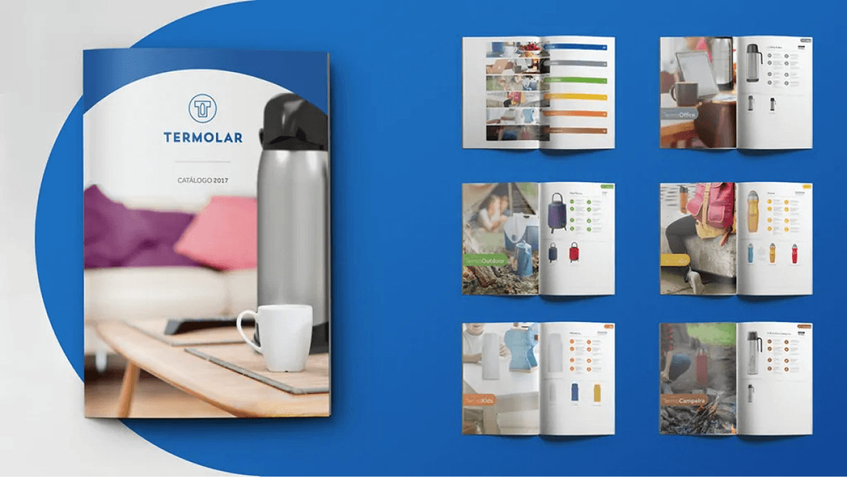
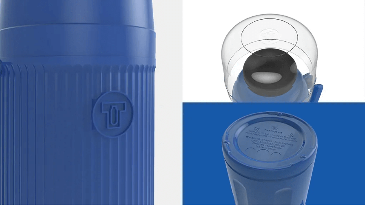
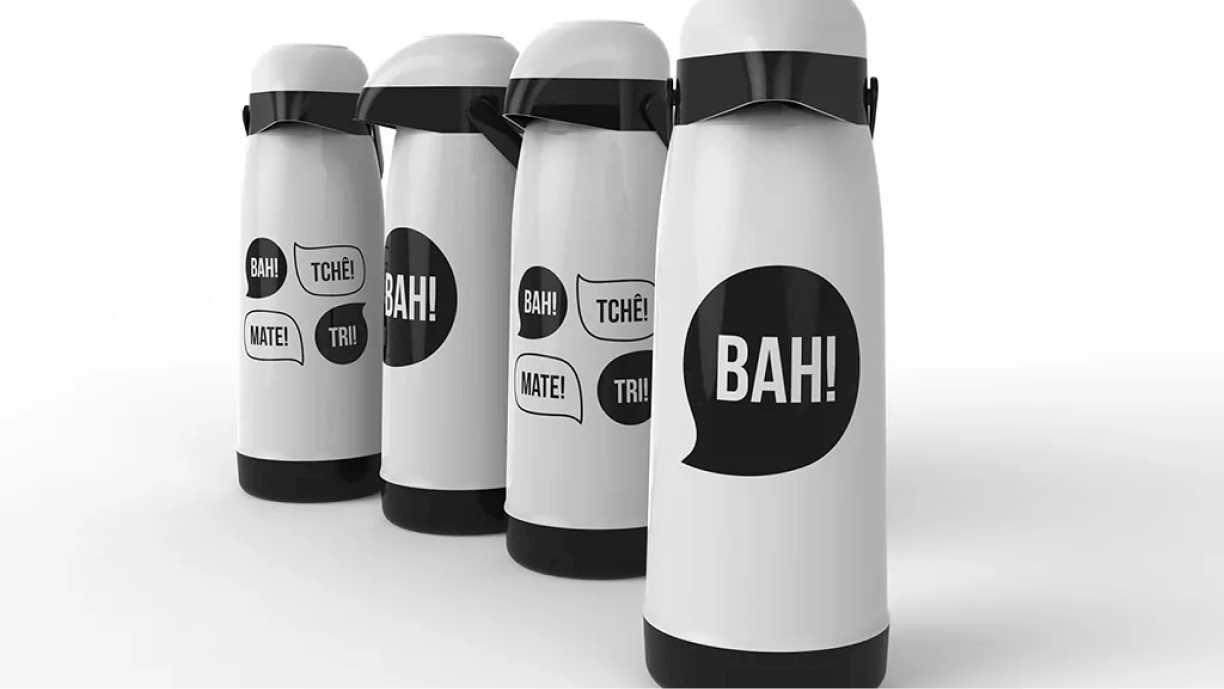
The brand’s applications on the products were also foreseen, in addition to the development of prints for the 2017 collection. The new symbol is in accordance with the product’s morphology, making the application harmonious and coherent. The new prints have a fun aesthetic, in keeping with the new positioning, with regional motifs from the south of Brazil, Termolar’s place of origin.
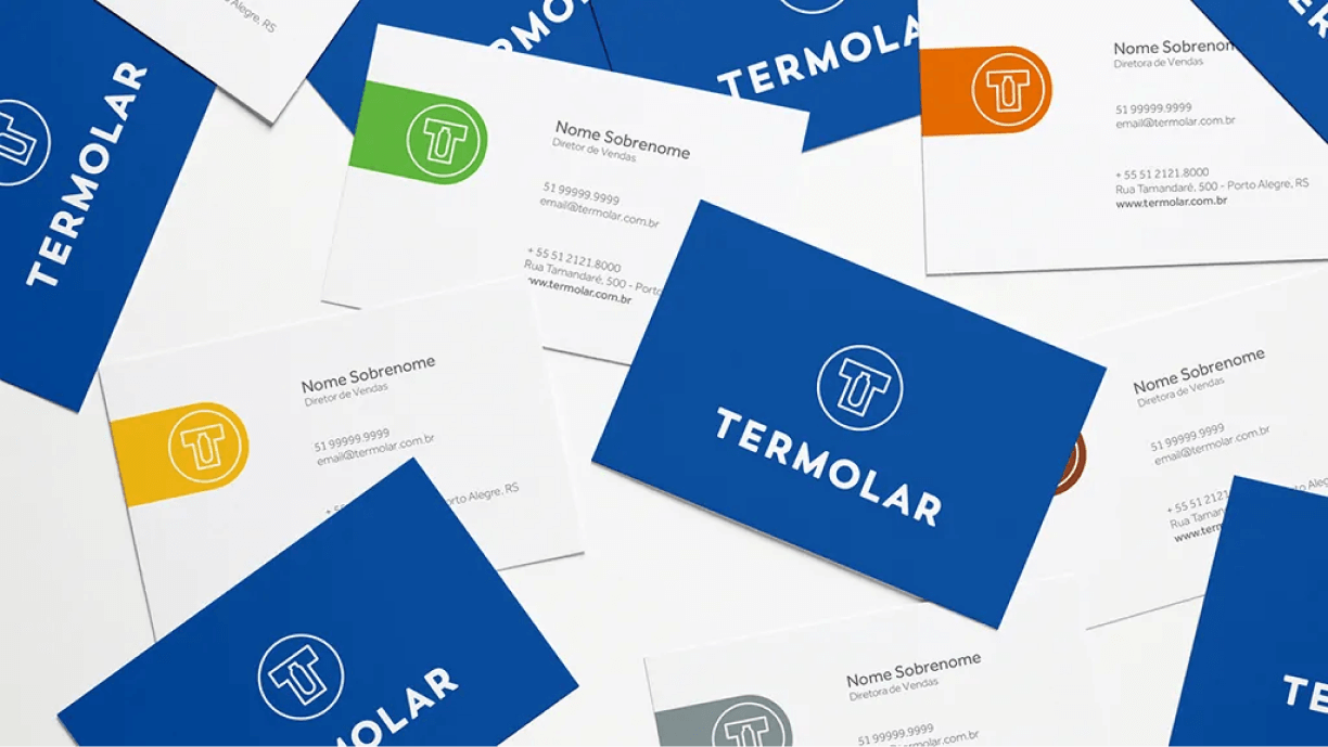
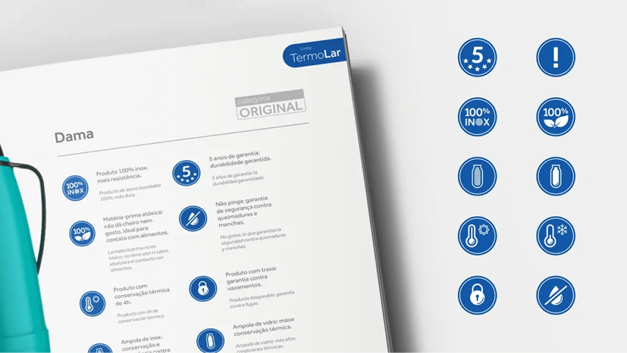
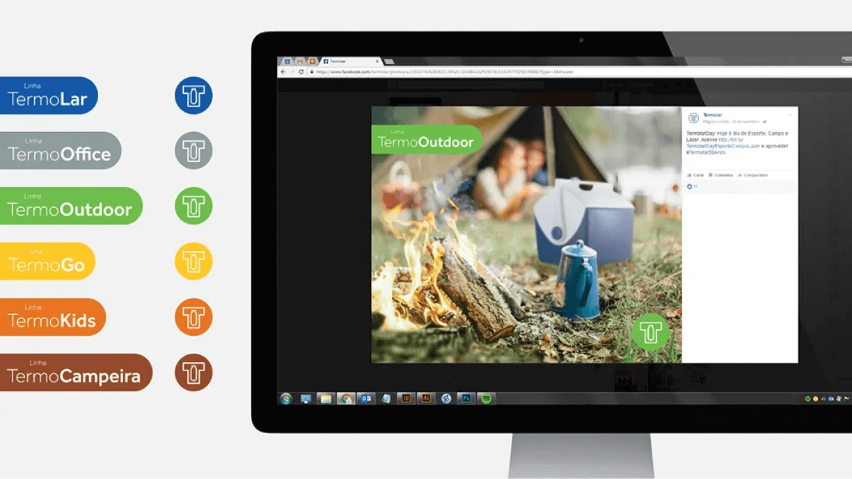
To facilitate product segmentation, lines with specific seals were developed. For promotional materials and social networks, a changing color application of the symbol was foreseen, according to the seals, to reinforce the lines. The chromatic separation of the lines was also used in the new product catalog. The editorial project reinforces the new visual identity and the colors warm up communication. For the presentation of the differentials of the products, several seals were developed that inform the characteristics in a clear and friendly way.