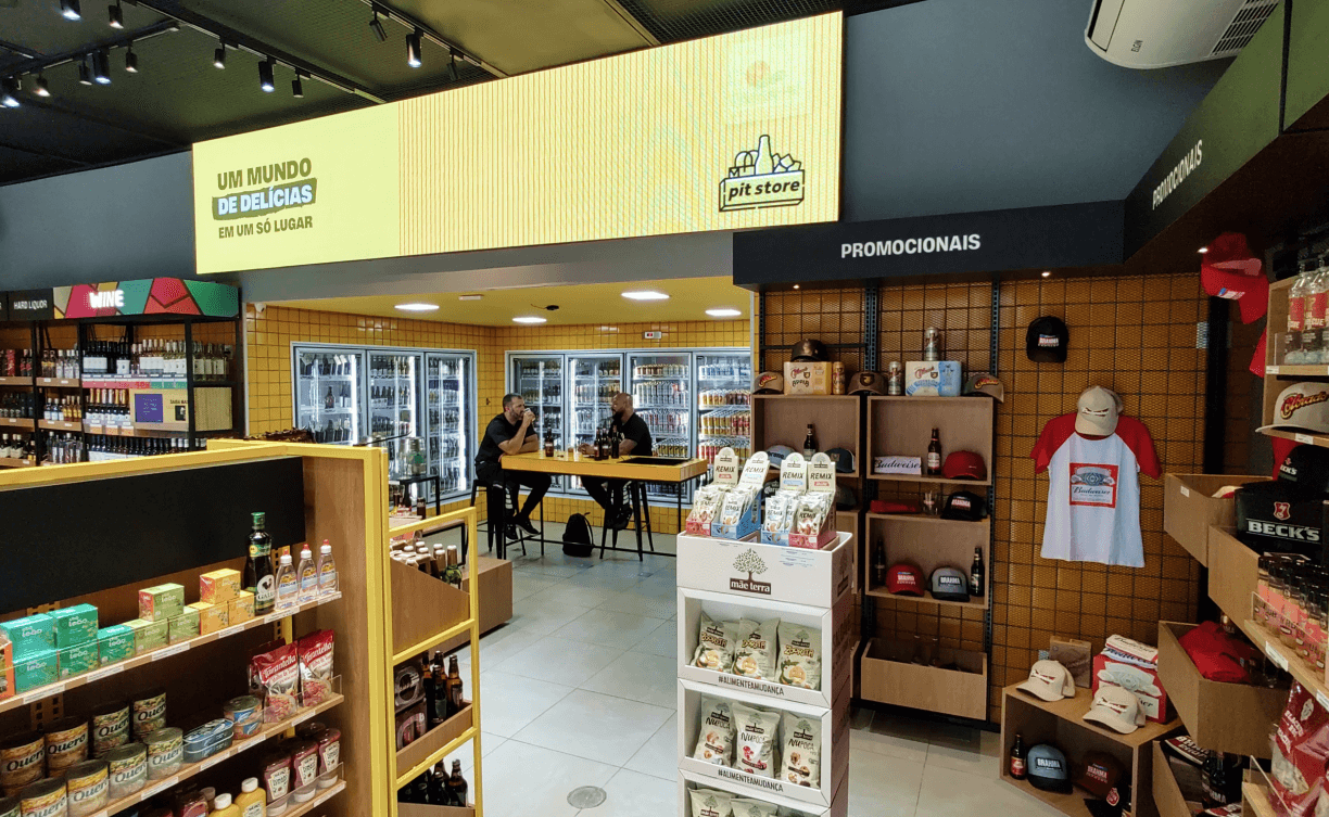
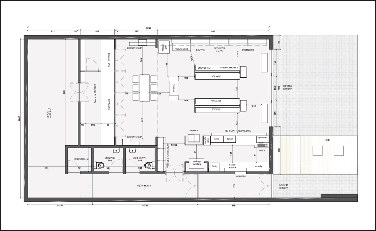
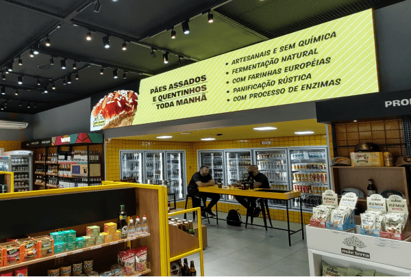
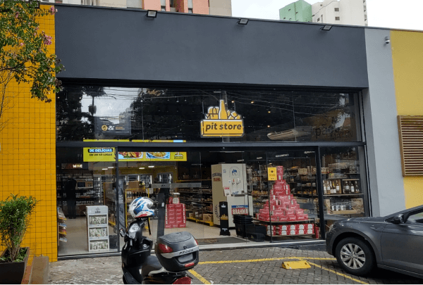
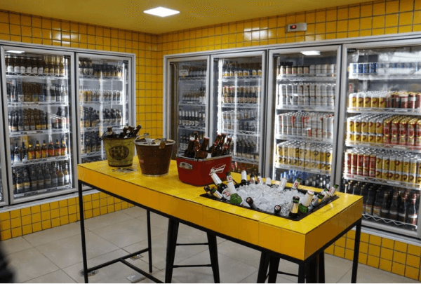
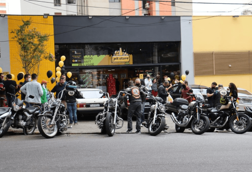
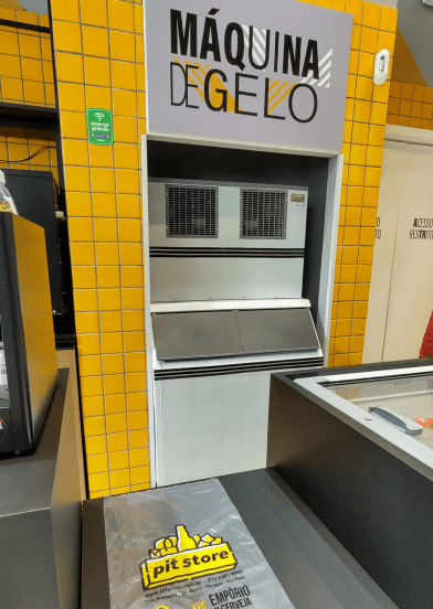
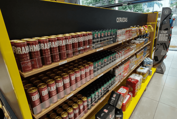
The company’s first Convenience Store for direct sales to the consumer, with a focus on presenting the complete product mix, both on display and ice cream. The centerpiece is the ice machine that generates a free ice refill and a walk in cooler with tasting space.
In addition to presenting ready-to-consume products, our objective was also to create a crossover of exposure with the brands’ merchandising materials, gifts and life style products, expanding brand awareness and generating purchase combos.
Branding.
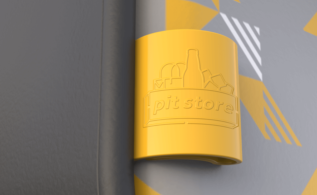
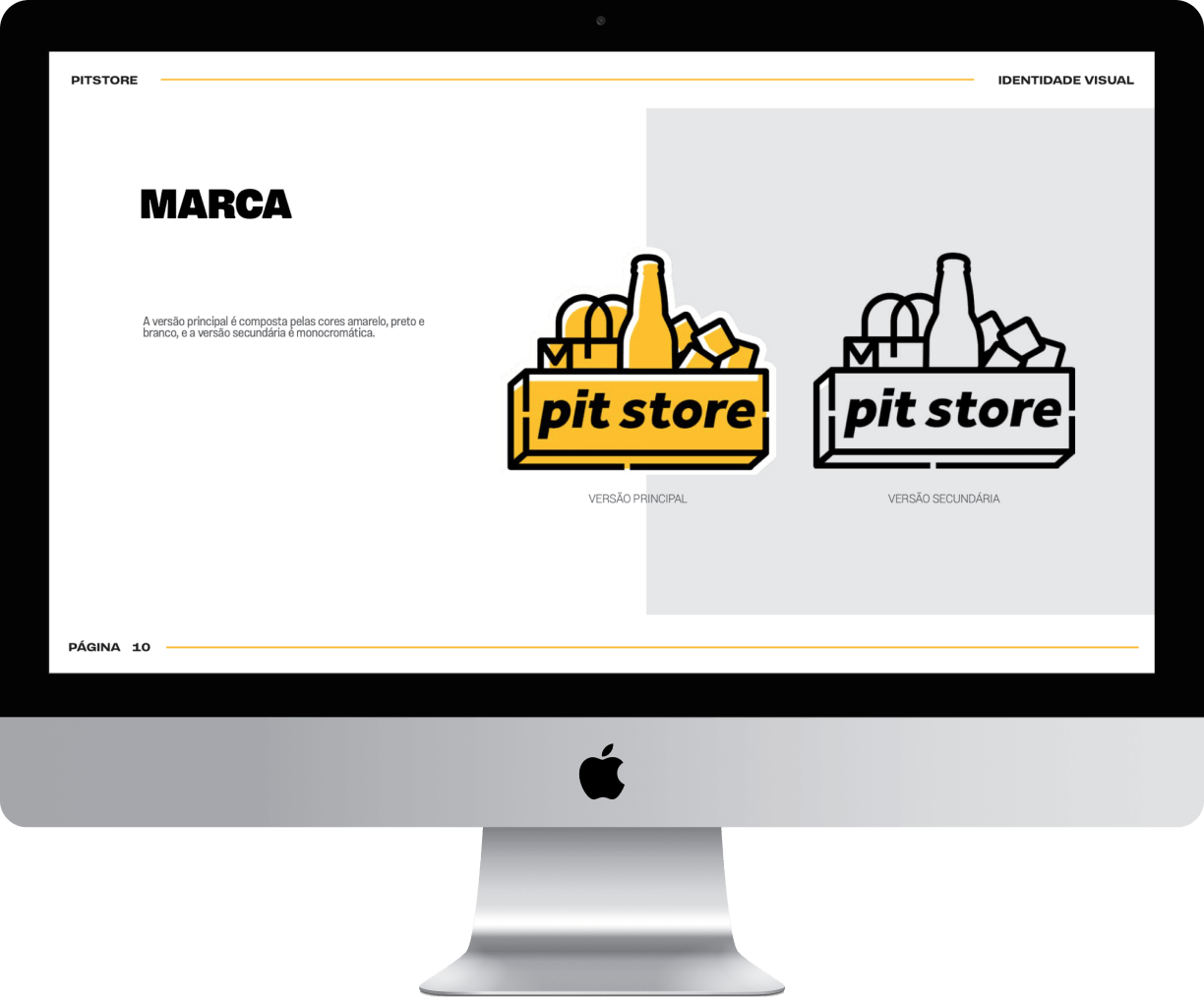
The PitStore brand was created from its sister brand, PitStop. As it is a convenience store brand, instead of the beer bottles present in the sister brand, it received some graphic pictograms that referred to items present in a convenience store, such as the bag and the ice cubes.
The rest of the features, such as the box, outline and colors, were inherited from the sister brand to maintain the unity and similarity between them.
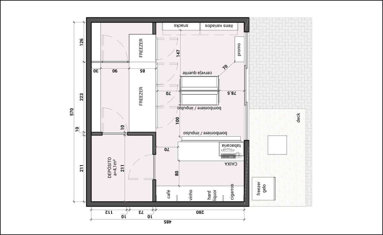
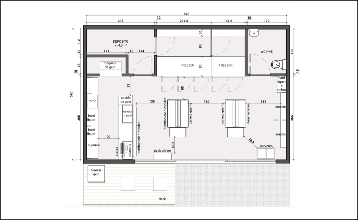
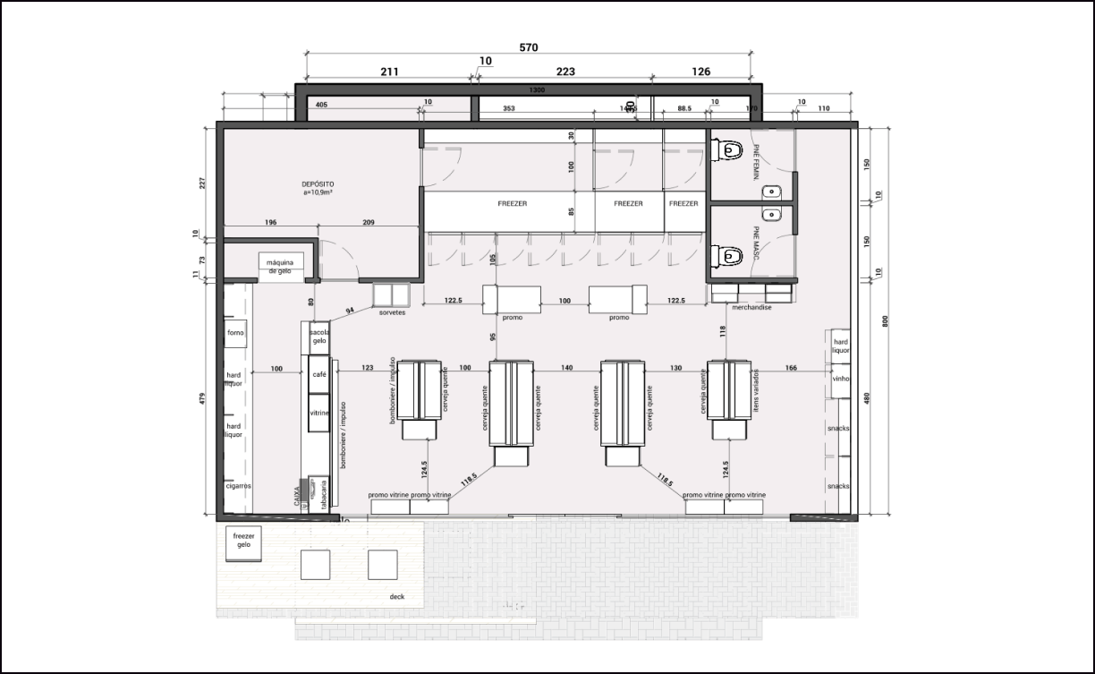
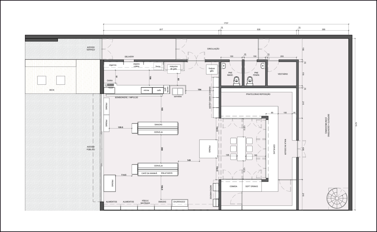
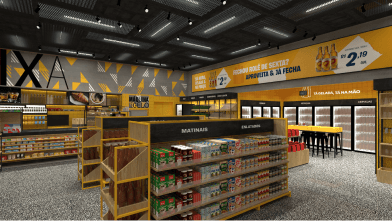
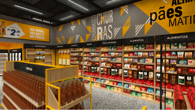
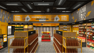
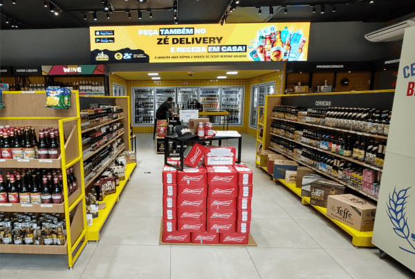
Architecture.
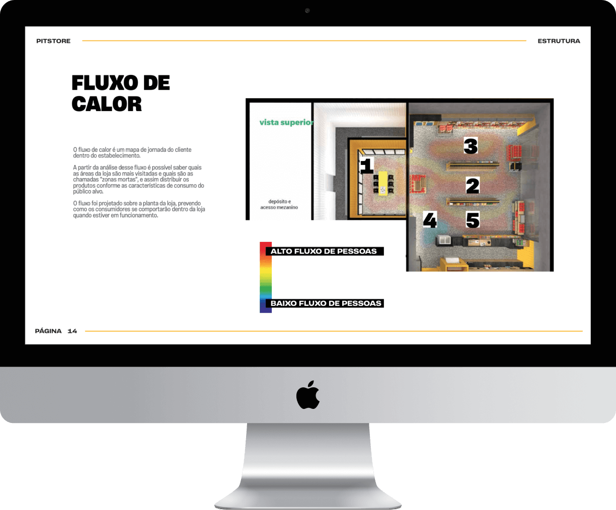
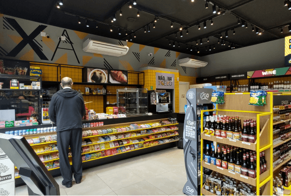
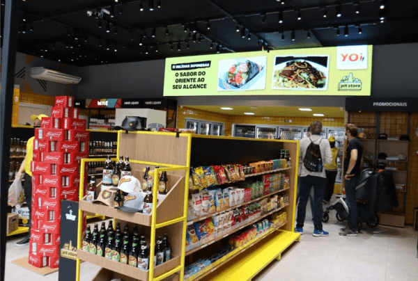
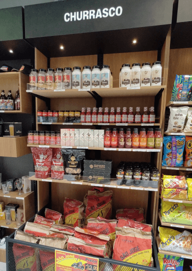
The store had exposure analysis by ABC sales curve, based on brand history and categories positioned according to a heat map. The materials used reflect the dynamism of the brands and a wide range of products supported by very direct and intuitive communication and signage.
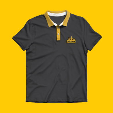
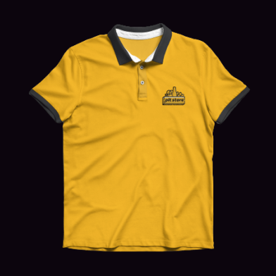
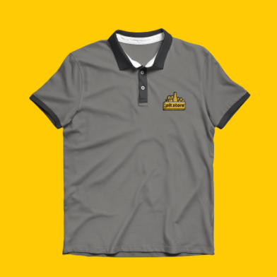
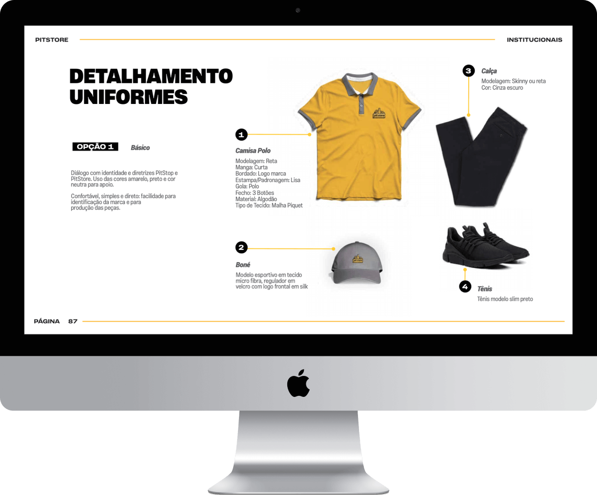
Uniforms.
In addition to the extension of the brand, the uniforms are practical and in line with the spirit of the Pit Store team. Knowledge of the brewing universe and belonging.
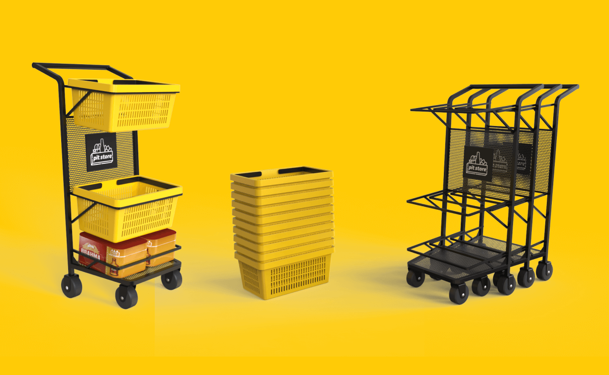
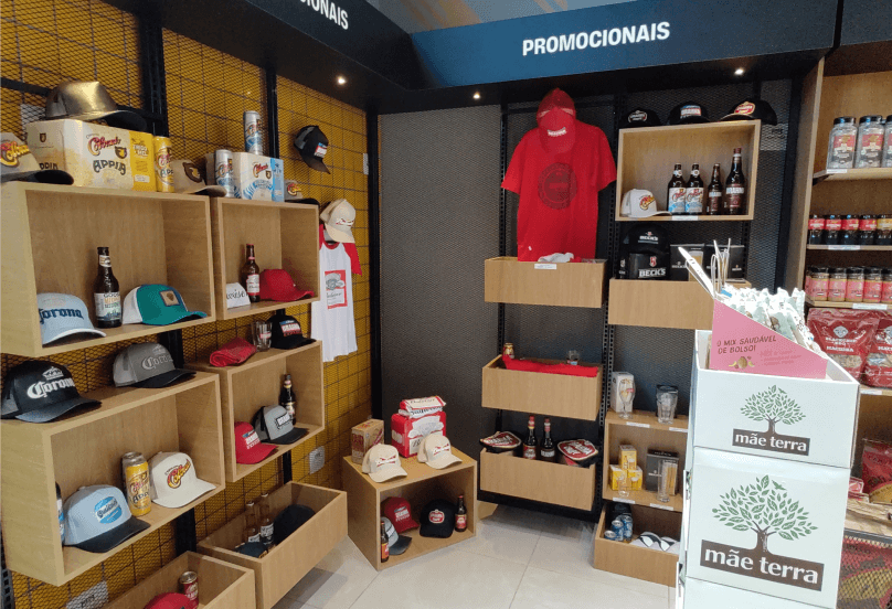
Point of sale materials.
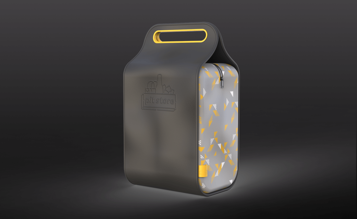
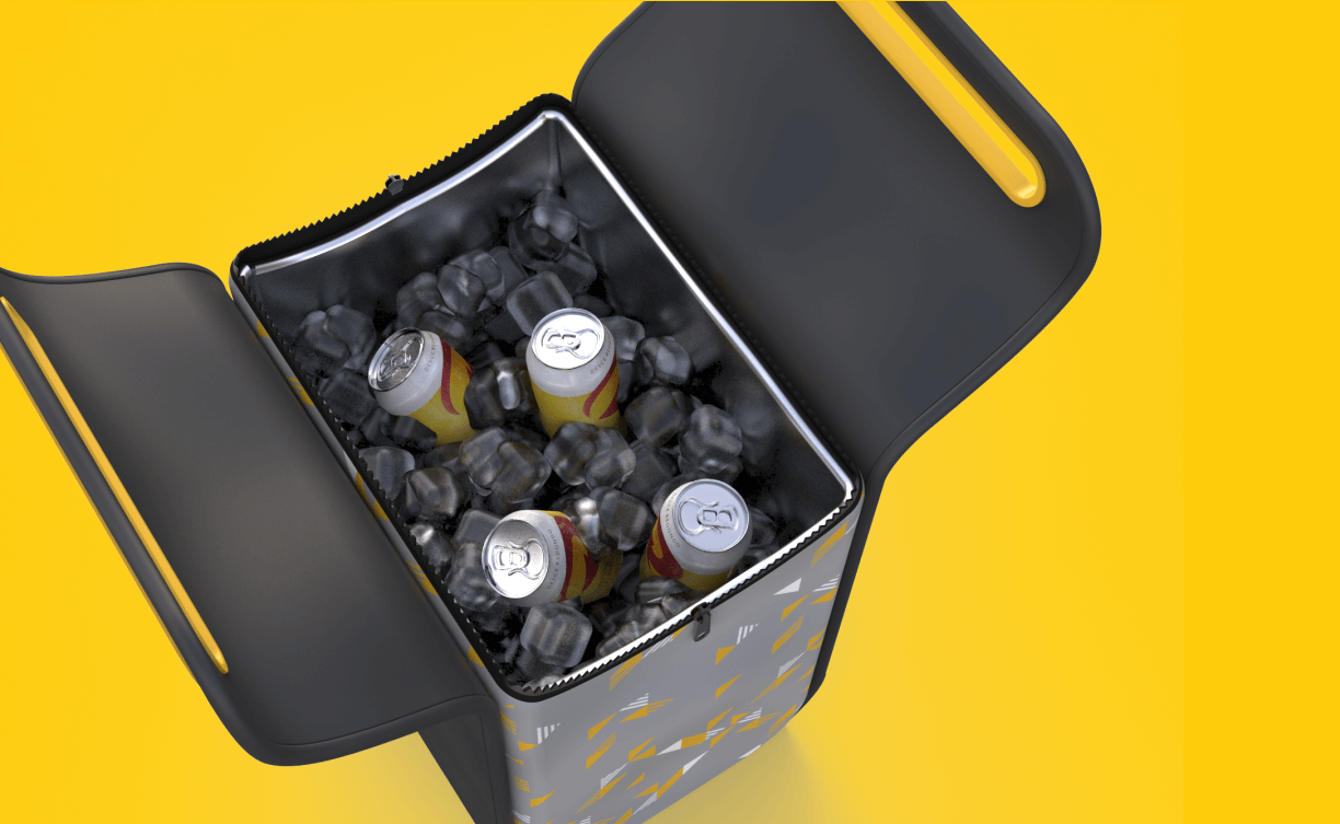
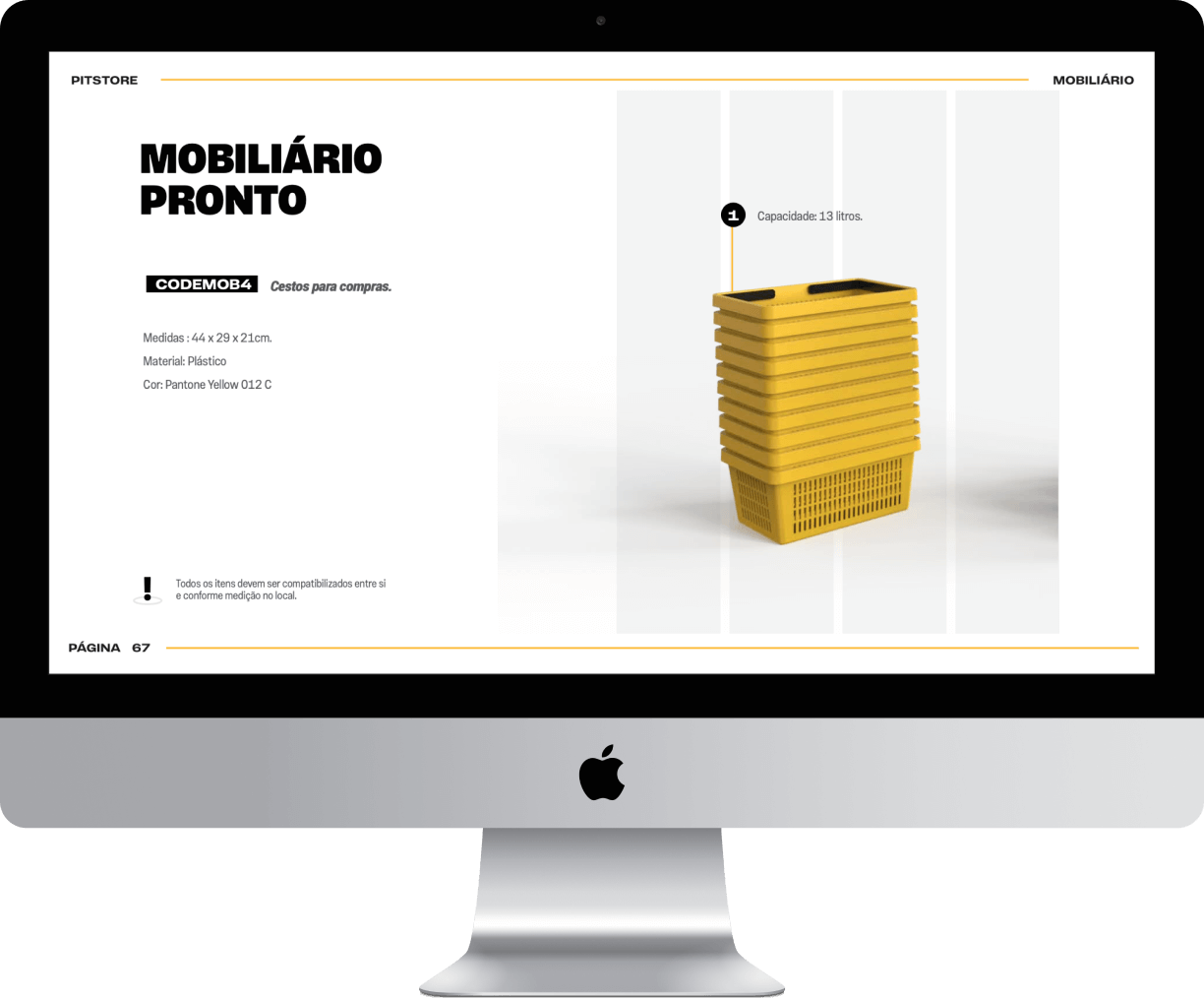
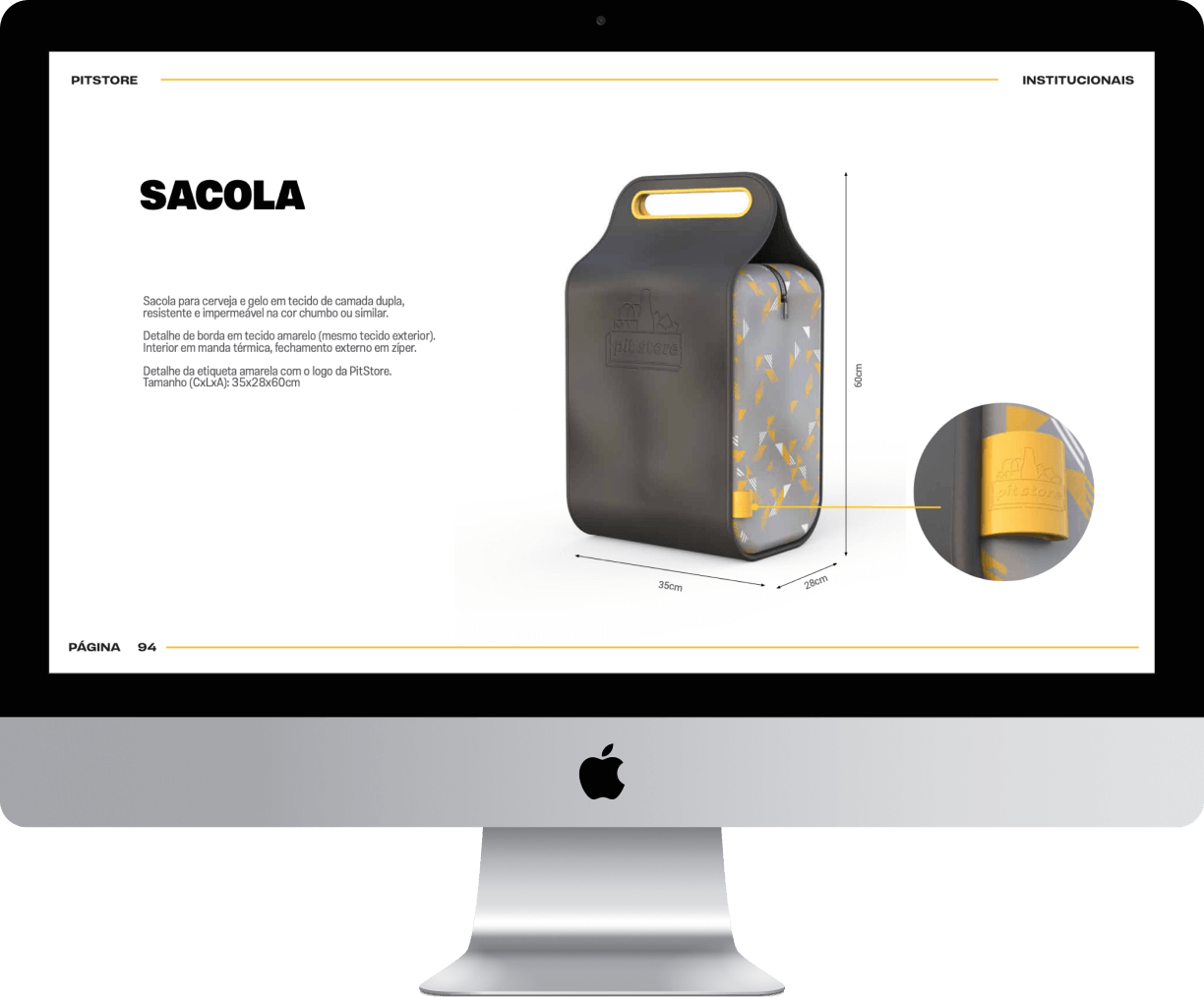
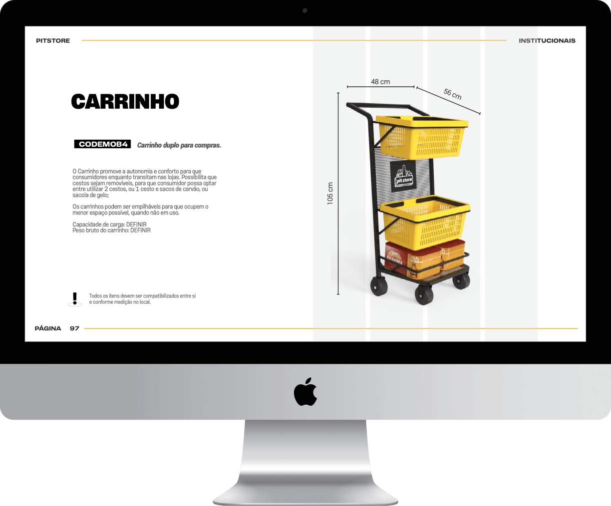
In addition to the characteristic mpdv, we developed proprietary equipment for the Pit Store, as well as the shopping cart and the ice bag, which became a great asset for the store, since refills are free.
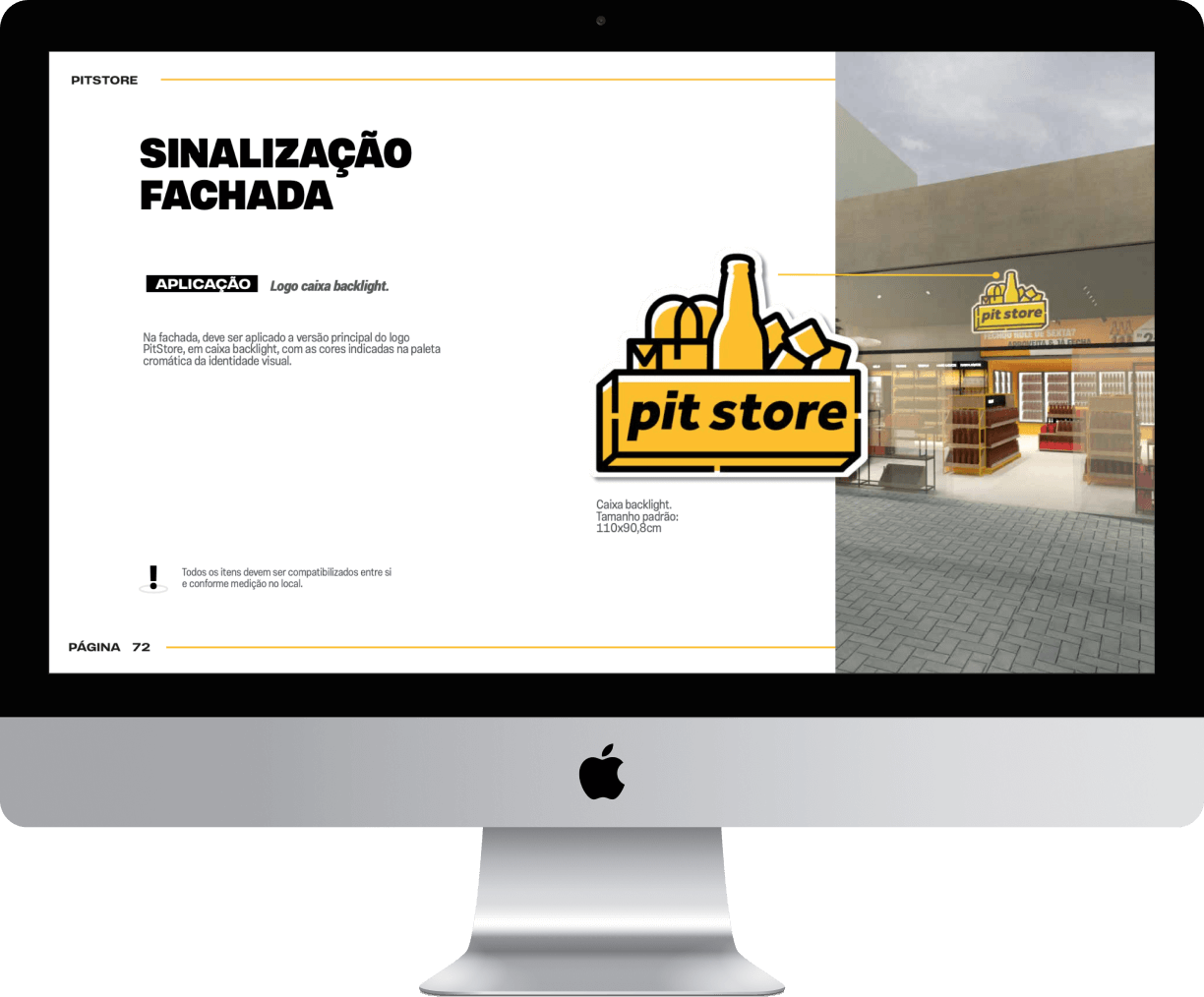
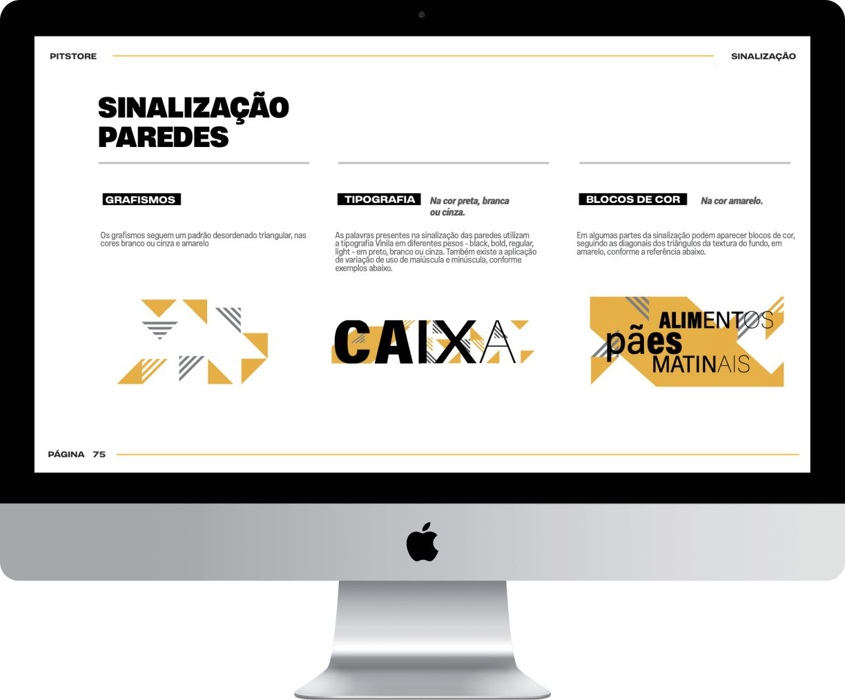
Signaling.
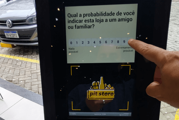
Signaling, informing and directing, this is how store communication was designed to encourage self-service and the perfect flow between the shelves.
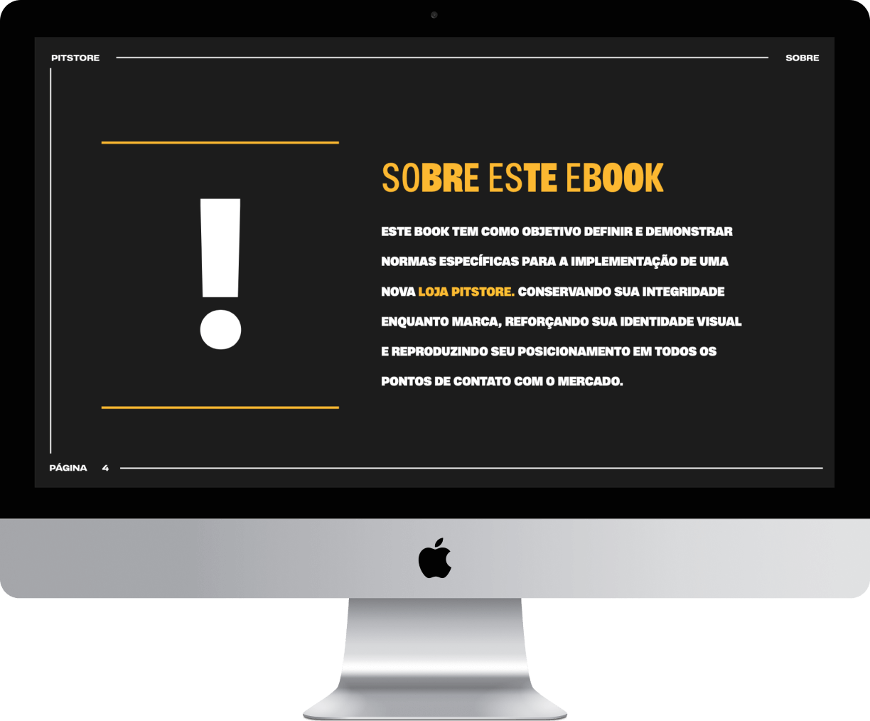
Guide Pit Store.
Final result.
Share it.
You may also like.
Good Pick
Granolas e Nuts
Branding
Seara
Seara Lookbook
Strategy
Ambev
Nexway
Branding
Grupo Fleury
Campana
Architecture, Awards, Branding, Prêmio Lusófonos da Criatividade
Rometal
Evo Sliding System
Awards, BDA, Museu da Casa Brasileira, Product Design, Red Dot